A Close-Up on Our New Look
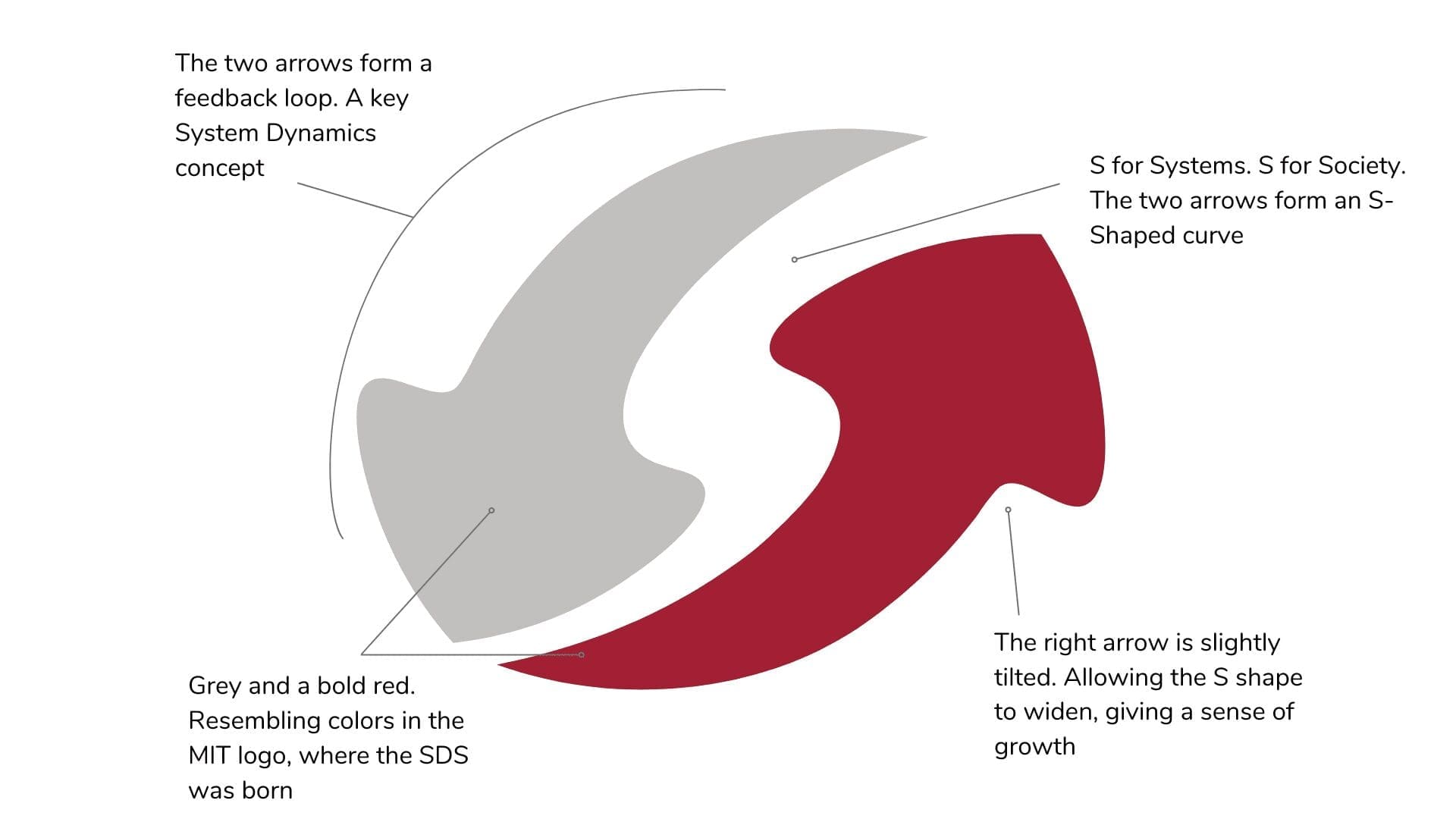
We are excited to reveal our new logo and branding, embodying the System Dynamics Society’s values and vision for the future. The looped arrows with an S curve symbolize growth, change over time, and commitment to raising complex systems awareness.
But what went into creating this fresh visual identity?
The Design Process: A Call for Creativity
In November 2021, the Society launched a call for designs, encouraging members to submit their concepts for an updated logo that would not only modernize the existing one but also better represent the society’s identity. We received 25 submissions from our members, which the marketing committee meticulously reviewed before narrowing down to a few options for presentation to a focus group. This focus group provided valuable feedback, and together, we selected the most fitting option. The policy council of the System Dynamics Society then voted on the final version of the logo, which stood out for its contemporary design and strong ties to the society’s identity and values.
Honoring Our Roots
In developing the new branding, we aimed to maintain a sense of familiarity with the previous logo, designed by Jack Pugh and George Richardson in 1984. George also contributed to the new logo’s design, offering various suggestions. We retained similar colors from the earlier design: two shades of grey and a bold red. These colors resemble those in the MIT logo, which holds significance since the System Dynamics Society was founded at MIT by Jay W. Forrester – a pioneering computer engineer and systems scientist. By preserving these colors, we honor the Society’s origins while refreshing its image for today and beyond.

Conveying System Dynamics Principles
The revamped logo showcases two arrows forming a loop, with the arrows’ shape creating an S curve. The right arrow is slightly tilted, allowing the S curve to progressively widen and generate a sense of growth. The left arrow is grey, while the right arrow features a bold red color. This design symbolizes the System Dynamics Society’s mission to expand the field, unify global endeavors, and enhance awareness and comprehension of complex systems phenomena.
Beyond Aesthetics: A Commitment to Mission and Values
Our new branding goes beyond a mere visual overhaul. It reflects the Society’s unwavering commitment to its mission and values. Moreover, by involving members in the logo’s creation, we have fostered a sense of ownership and engagement within our community.
Inspiring the Future
We hope that the updated logo and branding will motivate members of the Society and the wider System Dynamics community to keep pushing the boundaries of this fascinating field. Ultimately, the new branding is a testament to the Society’s dedication to its mission and values, and we eagerly anticipate how it will propel our impact and growth in the years ahead.
Recent Posts
Call for Presenters: Seminar Series
Call for Presenters: Seminar Series We at the System Dynamics Society are continually seeking vibrant and knowledgeable presenters for our ongoing Seminar Series. As we unfold the calendar, there’s always a place for more insights, experiences, and expertise to enrich...
Honoring Excellence: A Glimpse into the Awards of the International System Dynamics Conference
Honoring Excellence: A Glimpse into the Awards of the International System Dynamics Conference The International System Dynamics Conference brings together experts, practitioners, and students to exchange ideas, showcase real-world applications, and celebrate...
From Bergen to Global: UiB’s System Dynamics Group
From Bergen to Global: UiB’s System Dynamics Group The System Dynamics Group, an autonomous research group at the University of Bergen (UiB) was established in 1971 by professor emeritus Svein Nordbotten. Inspired by the work of Jay W. Forrester, Nordbotten...
Upcoming Events

MIT System Dynamics Seminar | Approaches to Encouraging Health Exchange Participation
You are invited to attend the System Dynamics Seminar being held on Friday, April 26th from 12:30-2:00pm EST in the Jay W. Forrester conference room, E62-450, or via Zoom: https://mit.zoom.us/j/94114971874 (Password: SDSP24). Our guest speaker will be Soheil Ghili...
Recent Business cases
Solving Bottlenecks in Dairy Production Facilities with System Dynamics
Solving Bottlenecks in Dairy Production Facilities with System Dynamics EXECUTIVE Summary FrieslandCampina faced potential bottlenecks in production due to the merging of two factories. They hired SD&Co which employed system dynamics simulation models to predict...
A Design Value Calculator: A System Dynamics Boardgame
A Design Value Calculator: A System Dynamics Boardgame EXECUTIVE Summary Product design is a specific form of complex innovation that touches all areas of an organization’s management. While entrepreneurs recognise the value of design, they often tend to focus...
The World Bank Uses System Dynamics to Identify Root Causes of Poverty
The World Bank Uses System Dynamics to Identify Root Causes of Poverty EXECUTIVE Summary Madagascar has one of the highest poverty rates in the world. In 2022, an astonishingly three out of every four people in Madagascar lived below the poverty line. Poverty has...
Join us
Q: What inspired the creation of the new logo?
A: The new logo was designed to modernize the existing one, better represent the Society’s identity, and embody its mission to expand the field and enhance global understanding of complex systems.
Q: Will this be the logo forever?
A: It will definitely be the logo tomorrow.
Q: How were members involved in the logo design process?
A: Members were invited to submit their design ideas, and the marketing committee reviewed all submissions before presenting a few options to a focus group for feedback and final selection.
Q: Why was it important to maintain some elements from the old logo?
A: Retaining certain elements, such as the color scheme, helps preserve a sense of familiarity and pays homage to the Society’s roots at MIT
Q: Why are there two arrows in the new logo?
A: The two arrows represent the Society’s mission to unify global efforts and create a continuous feedback loop for advancing the understanding of complex systems.
Q: Why was the color red chosen for one of the arrows?
A: The red color was chosen to maintain consistency with the previous logo and to symbolize the connection to MIT, where the System Dynamics Society was founded.
Q: I’ve spotted something that still has the old logo…
Thanks, eagle eyes! Let us know and we’ll get paintbrushes out.
Q: Will the new logo and branding be applied to all official Society materials and communications?
A: Yes, the new logo and branding will be consistently used across all official Society materials, communications, and platforms to reinforce the Society’s identity and commitment to its mission and values.
Q: What does the S curve in the new logo represent?
A: The S curve in the logo symbolizes the progressive growth and expansion of the field of system dynamics.


When can I purchase a t-shirt?
The letter S in the logo could also resemble a path. although it would take more, so if it was upside down, that is widest at the bottom and tightest at the top.
I like it – Well done!